✈️ During my studies at The UX Design Institute, I conducted a full UX case study for a fictional airline called Hikitia Air. My goal was to improve the digital airline booking experience — streamlining it to be fast, intuitive, and genuinely helpful to users. From research to prototype, I took on every role in the UX process.
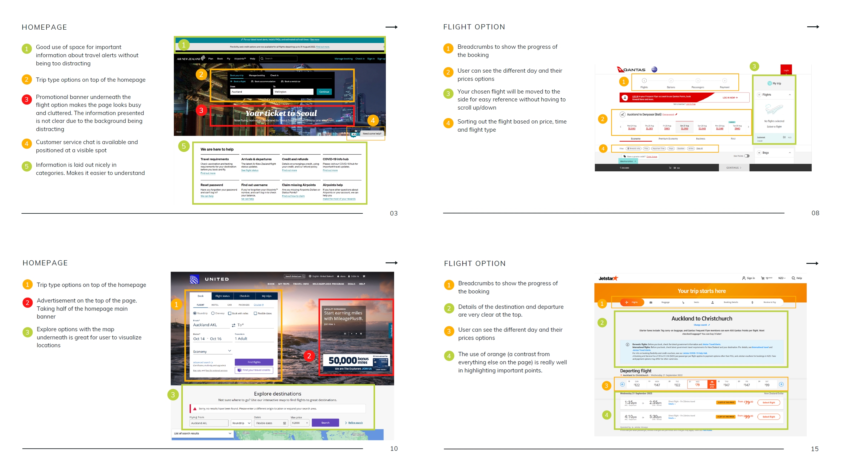
🔍 Competitive Benchmark
Before jumping into design, I studied top airline booking platforms to understand what they’re doing right (or wrong). Key questions I explored:
- What UX patterns are working well and worth adopting?
- What pain points keep recurring across platforms?
- What standards should I incorporate into my own flow?
🧪 Usability Testing
I ran usability tests on real airline websites to capture user behaviors, habits, and frustrations. A few takeaways:
- Users browse flights on mobile but prefer booking on desktop.
- Incomplete or scattered info causes user hesitation.
- Fare breakdowns were often unclear or misleading.
🧠 Affinity Diagram
Once research was gathered, I organized insights into themes using an affinity diagram. This helped synthesize findings and identify clear priorities for design.
- Observations from benchmarks, surveys, and tests were written on sticky notes.
- Grouped into thematic clusters in Miro.
- These categories informed both the Customer Journey and User Flow.
👉 Download the affinity diagram
🧭 Customer Journey Map
I created a detailed journey map to visualize the user experience from start to finish. This made it easier to spot friction points and opportunities for improvement.
🧩 User Flow
The user flow mapped out the ideal booking process and ensured every UX decision was based on real user insights.
- Covers the high-level steps in booking a flight
- Solves pain points identified in the journey map
- Prepares the foundation for wireframes and prototypes
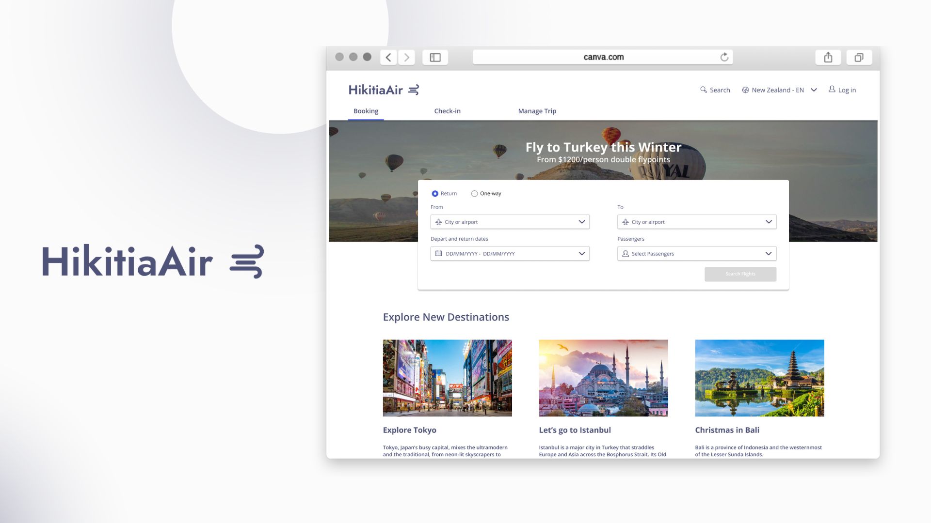
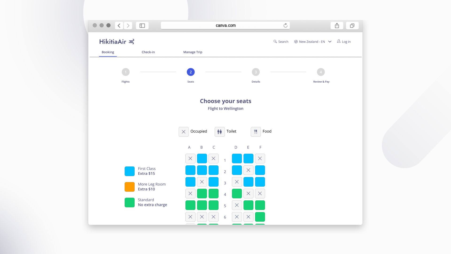
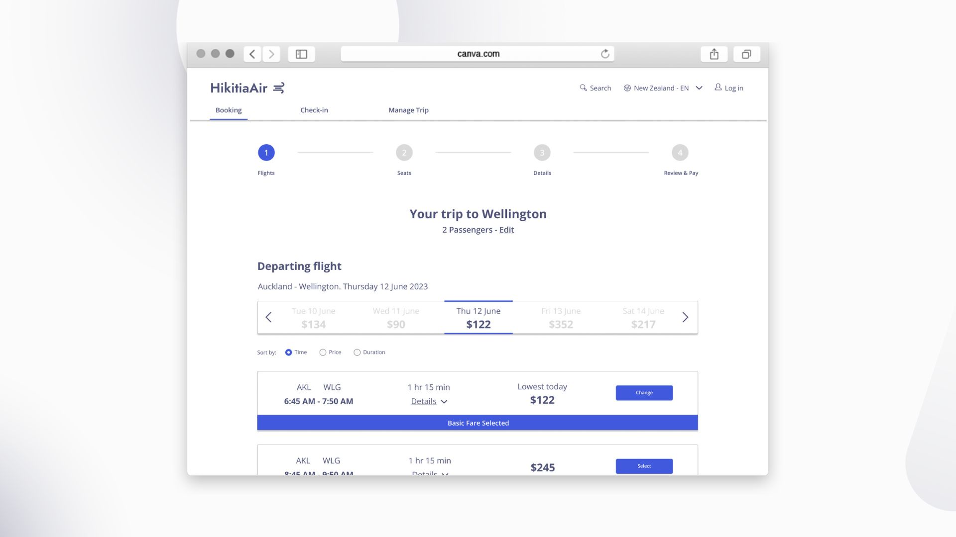
✨ High-Fidelity Prototype (Annotated)
I designed a high-fidelity prototype in Figma, integrating all research insights into one polished interface. It’s designed to be clean, efficient, and user-first.
🧪 Try the Prototype
👉 View Interactive Prototype on Figma
🎯 Results
This project was a comprehensive deep dive into UX design — from raw research to an interactive, high-fidelity prototype. It taught me how to ask the right questions, design for real users, and build experiences that are both delightful and efficient.